




What Is a Claude Animation Style?
A Claude animation style is a named visual convention you drop into a text-to-video prompt as one word. Teletext, Datamosh, Memphis, 1-bit dither: each name pulls a specific look and motion out of the model. You don’t describe a look across three adjectives. You name the style, and the model renders it. Each word compresses decades of design history into something the model already knows.
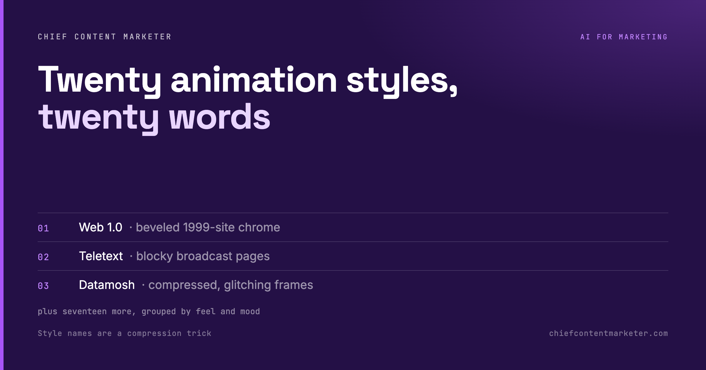
Style Names Are a Compression Trick
Ask for “something cool and retro” and you get mush. The instruction is a vibe, not a target. Ask for “Memphis” and you get 80s squiggles, confetti geometry, and a specific palette. One word compresses decades of visual convention into something the model already knows.
This is the most underrated prompting skill in visual work. The model has read more design history than any of us. Our job is to hand it the right proper noun and get out of the way.
There’s a reason most AI video looks the same. The prompts describe a mood instead of naming a style. Say “Teletext” and you get blocky broadcast pixels. Say “Datamosh” and you get corrupted, glitching frames. Every one of these looks has a name. The name is the prompt. That’s the whole lever.
The 20 Styles, Grouped by Feel
Grouped so you can pick by mood rather than scrolling a flat list. Each table below is one group: the style, what it looks like, and what to prompt it for.
Retro and interface.
| Style | What it looks like | Prompt it for |
|---|---|---|
| Web 1.0 | Beveled 1999-site chrome, tiled GIFs | Throwback product teasers |
| Teletext | Blocky broadcast pages, chunky pixels | Info-led motion graphics |
| Memphis | 80s squiggles, confetti geometry | Playful brand stings |
| Word art | Stretched chrome display type | Big-type title cards |
| Skeuomorphic | Stitched leather, glossy buttons | Nostalgic UI callbacks |
| Retro desk | Old-OS windows and icons | Desktop-core scene sets |
Organic and handmade.
| Style | What it looks like | Prompt it for |
|---|---|---|
| Watercolour | Bleeding washes, paper grain | Soft, human brand moments |
| Origami | Folded planes, sharp creases | Structured explainer intros |
| Collage | Torn edges, tape, layered scraps | Scrapbook-style edits |
Motion and abstract.
| Style | What it looks like | Prompt it for |
|---|---|---|
| Topographic | Flowing contour lines | Map-like data backdrops |
| Flow field | Thousands of particles on a vector field | Mesmerizing loops |
| Spirograph | Interlocking gears, looping curves | Hypnotic loaders |
| Op art | High-contrast optical vibration | Eye-catching hooks |
| Light painting | Glowing streaks in the dark | Product reveal accents |
| Aurora | Soft ribbons of colour | Calm, ambient transitions |
Texture and distortion.
| Style | What it looks like | Prompt it for |
|---|---|---|
| Psychedelic | Melting hue shifts | Max-attention scroll stoppers |
| Thermal camera | False-colour heat bloom | Tech-demo, heat-map looks |
| Datamosh | Compressed, glitching frames | Edgy, glitch-core edits |
| 1-bit dither | Two-tone stipple like an early Mac | Minimal, retro-icon looks |
| Neumorphism | Soft extruded plastic | Soft-UI product shots |
Two notes worth keeping. First, the group is a mood shortcut, not a rule. Teletext can be a loud hook, and Collage can be a quiet explainer. Second, the best styles are the ones you can describe in one word. That’s exactly what makes them good prompts.

The Formula: Subject, Style, Motion
Three slots, filled in order. The subject is what you’re showing. The style is the proper noun from the list. The motion is how it moves. Most people forget this slot.
“A coffee cup, animated in Teletext style, slowly pulsing.” That’s a complete brief. It tells the model what, the look, and the behaviour. Change one word and you get a different video. That’s why it’s cheap to iterate. Generate six, keep the one that fits, and move on.
This pays off most in short-form video and social graphics. A single striking look does more work than a polished brand system there. A 20-second style test costs one prompt and thirty seconds. That’s cheap enough to experiment wildly. It’s how you find the one look that becomes your signature.
Short-Form Video Is Where Attention Went
The reason to learn a style vocabulary is simple: the format has won. Video is now the default way buyers learn about a product. Short-form is the highest-return format in the mix. A distinctive style is what makes your clip stand out in a feed of talking heads.
Sources: Wyzowl Video Marketing Statistics, Cisco Visual Networking Index, HubSpot Video Marketing Statistics.
Match the Style to the Job
A style is a tool. Pick it the way you’d pick a font or a colour: by the job it has to do. Here’s a simple way to choose without scrolling the whole table.
To stop a scroll, use Op art, Psychedelic or Datamosh. These pull the eye with contrast and motion. They’re loud on purpose. They work best in the first half-second, where the only job is to interrupt a feed.
To explain something, use Teletext, Watercolour or Neumorphism. These hold a caption or a stat without fighting it. The frame stays readable, so the viewer gets the point instead of just the effect.
To show a product, use Light painting, Skeuomorphic or Neumorphism. These flatter a subject with glow, texture or soft depth. That’s what a product reveal needs more than a shock effect.
When the Look Fights the Message
A named style gets you a distinctive frame. It doesn’t tell you whether that frame belongs to what you’re saying. That judgment is still ours, and it’s where most wasted generations come from.
Legibility dies first. Neumorphism, 1-bit dither and heavy Datamosh all destroy small type. If the asset carries a caption, a stat or a call to action, test it at phone size first. Don’t fall in love with the preview. A style that needs a still frame to be readable is a still-image style, not a video one.
Style drift across a series. Generate ten clips in one style and they won’t match. Hue, grain and line weight move between runs. If this is a series, pick the two or three styles that hold together. Fix the subject framing, and reuse the same motion word every time. Consistency in AI video is a prompting discipline, not a model setting.
The style is louder than the brand. Psychedelic and Op art pull attention to the effect and away from the offer. That’s fine for a hook and fatal for a product shot. Use loud styles where the job is stopping a scroll. Use quiet ones where the job is explaining something. The mistake is treating a style as a signature to apply everywhere instead of a tool to apply once.
Rights and provenance. Naming a movement is safe. Naming a living artist or a specific studio house style is a different question, and it’s the one that gets a brand in trouble. Keep your vocabulary at the level of genre, era and technique. That’s also where the model is strongest.
One more trap worth naming: the style becomes the message. If the animation is the most interesting thing in the clip, the viewer remembers the effect, not the claim. The test is simple. Mute it, shrink it, and look at it for one second. If you can’t tell what’s being said, the style is doing too much work.
The practical version is a small test matrix: three styles, one subject, one motion word, generated back to back. Pick the one that survives being shrunk to a phone and muted. That’s the style you build the series on. It costs about two minutes.
The same discipline shows up across the rest of your stack. It’s the logic behind feeding a model real references instead of adjectives. It’s why a prompt framework beats free-form asking. And it’s the core of structured prompts the model actually obeys.
Build Your Own Style Vocabulary
This list is a starting kit, not the whole language. Every time you see a look you like, name it and add it to your own prompt file. Over a few months you’ll end up with a personal dictionary of visual styles. You can call on it instantly, which is a far better asset than any single prompt.
Start with the four groups above. Pick one style per post, keep the subject concrete, and always name the motion. That alone makes your output look less like AI and more like a choice.
Claude Animation Styles: Quick Answers
What are Claude animation styles?
They’re named visual conventions, like Teletext, Datamosh or Memphis, that you drop into a text-to-video prompt as one word. The model renders that specific look and motion instead of a generic one.
How do I prompt Claude to animate in a specific style?
Use the three-slot formula: subject, style, motion. For example, “a coffee cup, animated in Teletext style, slowly pulsing.” Keep the subject concrete, name one style, and always name the motion.
Which styles work best for short-form video?
For hooks, Op art, Psychedelic and Datamosh stop a scroll fast. For explainers, Teletext, Watercolour and Neumorphism hold a caption without fighting it. Pick one of each and reuse the pair.
Can I combine two styles in one clip?
Usually not. Stacking two or three style words tends to give you a blurry average of all of them. Generate each style separately, then cut between them if you want a mashup.
Do I need animation experience to use these?
No. You’re learning a vocabulary, not animation software. The prompt is the skill, and it’s the cheapest creative upgrade on the table.