




Ask a model for a landing page with no references and you’ll get the page everyone else gets. Rounded cards, a gradient hero, three feature columns, a generic call to action. The model has seen everything, so with no target it returns the mean of everything.
What Are AI Design Reference Sites?
AI design reference sites are curated galleries of real, high-performing design work, sorted by asset type. You paste a few examples from one gallery into a prompt. The model then lifts the section order, hierarchy and proof placement instead of inventing a layout from its training data. The output reads like a page someone actually shipped, not a template the model guessed.
They fix the biggest gap in AI design, which is direction. A model has seen millions of pages but can’t tell which ones work. Without a reference it returns the most common pattern it knows, which is why everything it makes starts to look the same.
AI Designs the Average
Design quality is a retrieval problem before it is a taste problem. The model has plenty of ability. It just lacks direction. Say “make it modern and clean” and you have told it nothing it can act on. So it reaches for the most common pattern in its training data.
a Nature study on model collapse shows what happens when a model keeps pulling from its own output. The systems drift toward sameness, because the unusual gets averaged out over time. A reference gallery is the counterweight. It pulls the model back toward work a human already chose.
Hand a model 5 landing pages that actually convert and it stops inventing. Now it has a structure to copy: this many sections, proof here, the ask in this position. That’s the whole trick, and it works for every asset type, not just web pages.
The Reference Libraries Worth Bookmarking
One gallery per asset type. Feed the right one and the output stops looking generated.
| # | Site | What it gives the model |
|---|---|---|
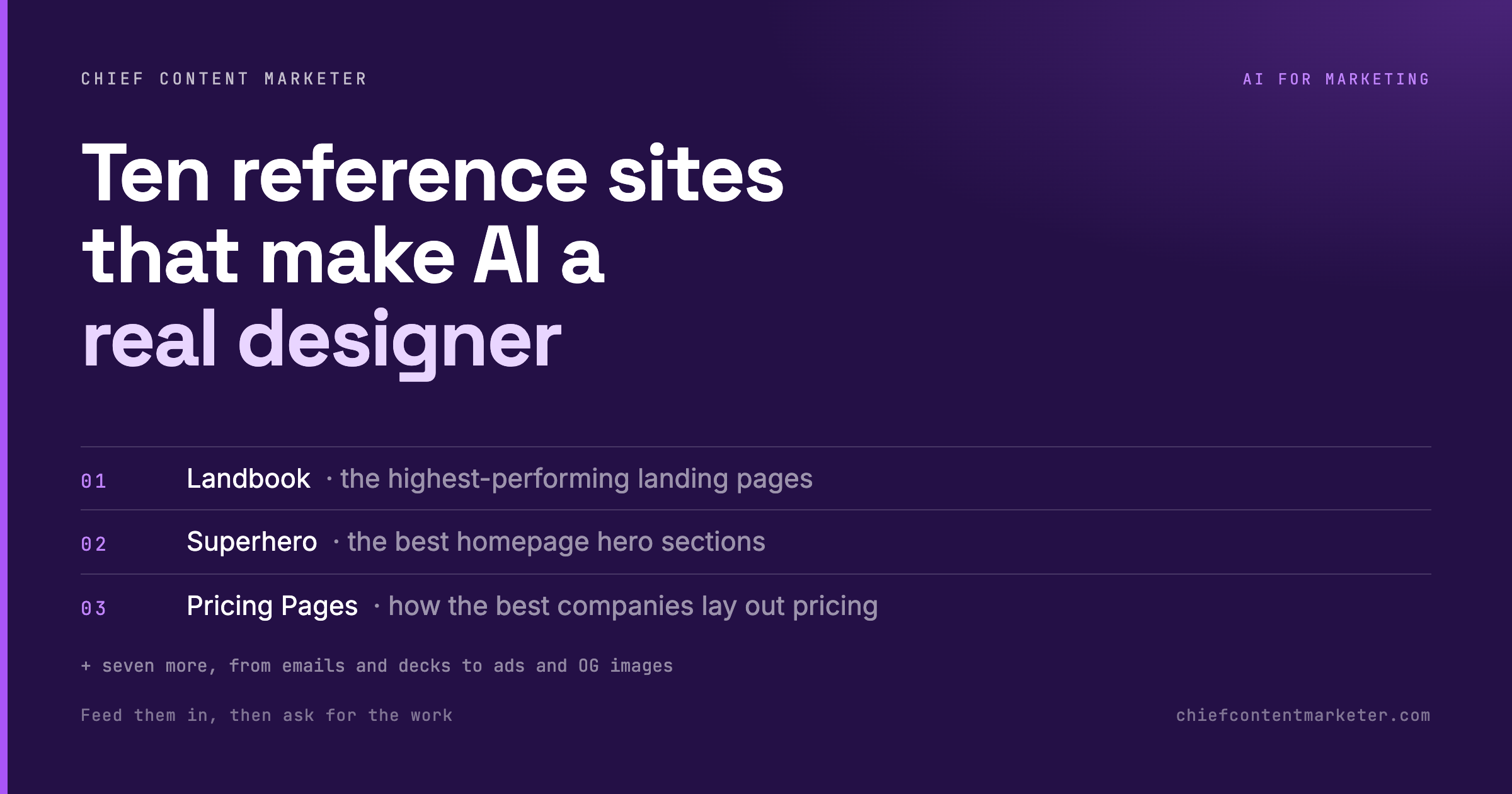
| 01 | Landbook | High-performing landing pages, organized by what actually drives signups. |
| 02 | Superhero | The best homepage hero sections, isolated so you can study one decision at a time. |
| 03 | Pricing Pages | How strong companies structure tiers, anchors and feature rows for revenue. |
| 04 | Social Proof Examples | Roughly 200 ways to show testimonials, logos and case results. |
| 05 | Really Good Emails | A large library of marketing emails from brands that actually send well. |
| 06 | Deck.Gallery | Slide decks, reports and brand guidelines from companies like Nike and Burger King. |
| 07 | Posts.Design | Social posts filtered by style and colour, so you can hand over a lane, not a mood. |
| 08 | Adfolio | Real Instagram, Facebook and LinkedIn ads, annotated with why each one works. |
| 09 | Navbar Gallery | Navigation menus, from plain navbars to mega-menus holding whole sections. |
| 10 | OG Image Gallery | The preview images that appear when a link is shared, built to be clicked. |
Show Structure, Not Vibes
The list is the easy part. The prompt is where most people lose the benefit. Pasting ten random links produces a mush of ten different styles. Pasting three from the same gallery, then asking for the structure, produces something you can actually build on.
Ask what’s above the fold, how many sections the page runs, where the proof sits, what the call to action says, and what got cut. Then ask for your own layout that follows the same structure with your content. Reference the pattern first, design second. Doing it in that order is the difference between a page that looks like the model’s opinion and one that looks like the market’s evidence.
Paste these three pages from the same gallery and describe their shared structure:

1. [link]
2. [link]
3. [link]

Tell me, in plain language:
- The section order from top to bottom
- What the hero promises in one sentence
- Where social proof sits and what form it takes
- What the call to action says and where it appears
- What the page deliberately leaves out

Then propose a layout for my [asset] that follows that same structure.
The same discipline carries over to motion. The Claude animation styles guide lists 20 reference styles you can hand over the same way, one gallery per job. For a stricter prompt format the model can’t ignore, XML prompt engineering wraps every instruction in a tag it will actually obey.

Three Ways Reference Work Goes Wrong
Handing a model references is a lever, not a guarantee. It cuts both ways depending on how you use it. Three failure modes show up again and again.
The first is copying the surface. You paste five landing pages, ask for something like this, and get the layout back with your logo dropped into it. That’s a skin, not a design. The fix is to ask for the structure in words before any code or copy is generated. Make the model describe the section order, where the proof sits, what the hero promises, and what the page deliberately leaves out. Once that description exists you can argue with it. You can’t argue with a rendered page.
The second is mixing galleries. A pricing page reference and an email reference teach different rhythms, different densities and different amounts of proof. Blend them and the model averages them, which is the exact failure you’re trying to escape. One asset type per request. If you need both, run two requests.
The third is referencing work you can’t sustain. A gallery of award-winning sites hands you a structure built on custom illustration, motion and a copy team. You can copy the structure and still ship something that collapses, because the proof that layout depends on doesn’t exist yet. Reference work one tier above you, not five. The gap should be reachable in one project, not one year.
There’s a cheaper version of the same discipline, and it costs nothing. Steal the skeleton, not the skin. When you find a reference you like, write down its section order as a numbered list before you screenshot it. That list is portable. Screenshots aren’t. The next model release will render them differently, while section order, proof placement and the position of the ask survive every model change.
The way to run this without drifting is a short loop. Pick the asset type, open the matching gallery, save three examples that share a structure, and have the model describe them in plain language. Then write your own brief against that description. Only when the brief reads like something you’d defend in a meeting do you ask for the page, the email or the ad. Refine by comparing your output against the originals, one decision at a time.
I keep this prompt saved in my notes and paste it before every request. The same principle applies to every layer of the stack around this. Give the system a target instead of an adjective. That’s the argument in the five-layer AI operating system, and it’s why a prompt framework beats a folder of saved prompts.
Better Inputs Beat Better Prompts
Everyone’s looking for the magic prompt. The people shipping good-looking work with AI are doing something less glamorous. They’re handing over examples. A reference gallery turns a vague instruction into a brief, and a brief is what a designer has always needed to do good work.
Start with the one asset you produce most. Bookmark the matching gallery, build the habit of pasting three links before you ask for anything, and watch how much less editing you’ll do afterwards. This is the loop I run every week.
Quick Answers
What are the best sites to make AI design look professional? Landbook for landing pages, Pricing Pages for pricing tables, Really Good Emails for email, and Deck.Gallery for decks. Pick the gallery that matches the asset you’re building and paste three examples from it.
Should I paste references into ChatGPT or Claude? Either works. Both read a link and lift structure from it. The bigger variable is the gallery and the prompt, not the model.
How many reference links should I give the model? Three to five, all from the same gallery. Three’s usually enough to surface the shared pattern. More than five tends to blend into a mush.
Can I use these sites for anything besides landing pages? Yes. The list covers emails, decks, ads, social posts, pricing pages, navigation and link previews. One gallery per asset type. That’s the rule.
Why does AI design look generic? Because a model with no reference reaches for the most common pattern in its training data. Give it specific examples and it’ll copy structure instead of averaging everything.